
Onboarding Redesign
SuperMoney PFM App
Background
We launched SuperMoney’s Personal Finance Management (PFM) app to the public in August 2025. Shortly after launch, we observed through session recordings and user feedback that onboarding completion rates were significantly lower than expected, with many users abandoning the flow early.
-
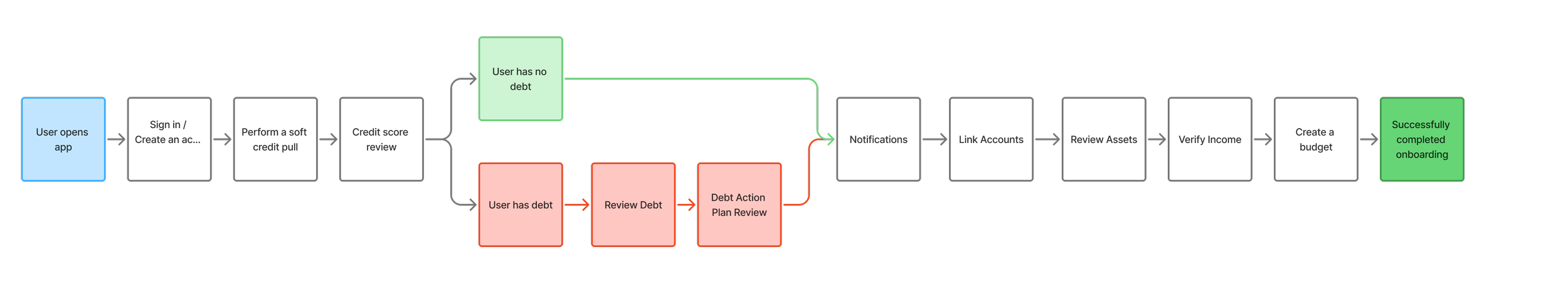
Users were dropped directly into the app with onboarding steps listed for them to complete in order.
-
74% of invited users dropped off after the credit pull
25% continued to linking accounts
0.07% continued to the budget creation
0.025% completed onboarding
-
Recordings showed that many users were confused about what to do next.
The open-ended design left users feeling lost and without clear direction.
Very text-heavy and hard to follow
2nd iteration:
Locked Sequential Workflow
-
Users were required to complete the full onboarding flow (credit pull, linking accounts, budget creation) before accessing app features.
-
36% of invited users completed the credit pull
25% linked an account
Only 0.08% progressed to reviewing assets
Only 0.06% created a budget and completed onboarding
-
Users dropped off during account linking and budget setup, citing the flow as too long and cumbersome.
Requiring significant setup before showing the app’s value discouraged continued use.
Budgeting took a long time to complete
Too many screens in the workflow; how can we simplify?
Key Takeaways
1st iteration was too open-ended - users didn’t know where to start.
2nd iteration was too rigid and front-loaded - users felt burdened before seeing value.
Current Hypothesis — we need a middle-ground solution:
Get users into the app faster.
Require at least a credit report (essential for providing meaningful insights).
Defer more tedious tasks (e.g., linking accounts, creating budgets) until later—after users experience the app’s core value.
1st iteration:
Open Onboarding Path
The Team
The team consists of 3 Engineers, 2 Product Managers, CEO, Director of Content, 1 Data Science Engineer, and 1 Product Designer.
As the product designer, my responsibilities are:
Taking part in competitor research, user interviews, surveys and testing
Ideate and find design solutions for requirements
Lead presentations and discussions with the team to gain feedback
Continuous design iterations and prototyping, creating simple and intuitive solutions
Assist in product requirements documentation
Multiple rounds of QA for mobile and web
Working closely with engineering team to ensure implementation is going accordingly
Competitor Research
RocketMoney is our most popular competitor in the space that has similar features that we are implementing.
Takeaways from onboarding:
Rocket Money uses a mandatory onboarding flow, but the screens are kept simple and approachable.
The flow includes strong social proof, reinforcing trust and credibility.
While there are multiple steps, the process feels straightforward and manageable.
Budget setup is not included during onboarding.


Guiding UX Principals
Key findings:
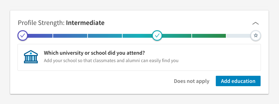
Show progress (Endowed Progress Effect) to boost completion.
LinkedIn - Profile completion bar with no defined “end,” motivating users to keep adding details.
Duolingo - Progress streaks and visual checklists that encourage daily engagement.
Grammarly - Onboarding tasks show progress towards “setup complete.”
Balance control and guidance: let users feel choice while nudging them forward.
Robinhood - Lets users explore the app even before funding their account, providing value early.
Spotify - Offers the option to skip personalization steps but rewards those who complete them with better recommendations.
Slack - Guides teams with setup tips but allows skipping to “just start chatting.”
Stage onboarding: start with simple actions, then layer in investment tasks after showing value.
Dropbox - Starts with one simple task (“Add a file”) before asking users to install apps, share folders, or refer friends.
Notion - Gives users a pre-filled workspace template so they see value right away, then nudges them to add more data.
Canva - Lets users start designing quickly before asking them to set up teams, upgrade, or explore advanced features.
Time investments well: build trust and reciprocation before asking for effort.
Twitter (X) - Lets you consume content before asking you to follow accounts or tweet.
Medium - Allows free reading first, then prompts for account creation and subscription once value is clear.
Headspace - Starts with a free meditation session before asking for payment or habit setup.
Match effort to motivation: if drop-off occurs, you’re asking for too much too soon.
TikTok - Immediately shows content on launch (no setup) so value is instant, then progressively nudges account creation and personalization.
Pinterest - Lets users browse boards quickly, only later asking them to refine interests and create an account.
Amazon - One-click browsing and purchase before nudging users into wishlists, Prime signup, or reviews.

Personas

User Flow
Previous User Flow
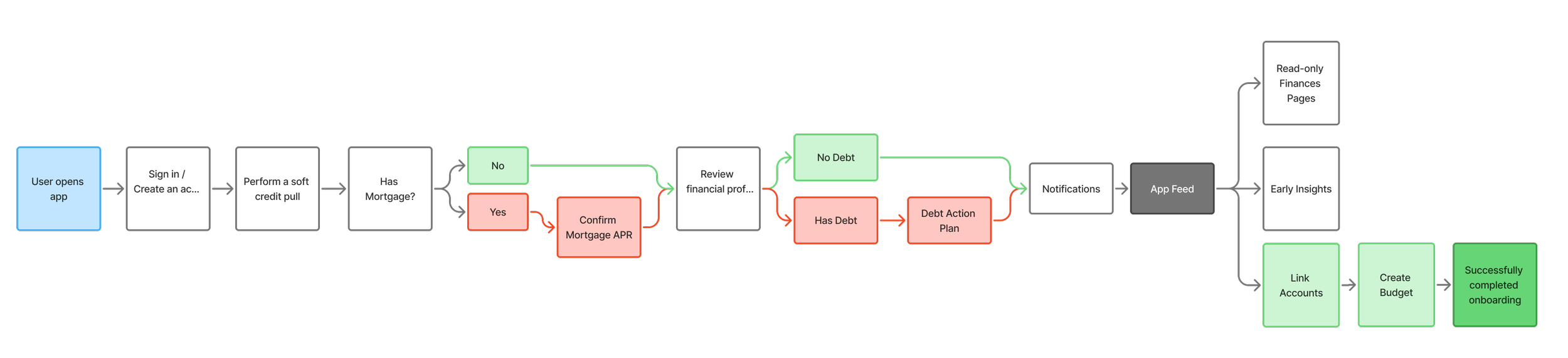
New User Flow
Information Architecture

Low Fidelity Wireframes

High Fidelity Mockups
Prototype
Our Goals

Outcome &
Key Learnings
Reflecting on this project, I realize that we could have benefitted from a clearer starting point. The initial idea, sparked by the CEO, was quite vague, and there wasn’t a well-defined problem to guide the app design process. In hindsight, we should have invested more time in defining the problem thoroughly and conducting proper research before jumping into design work. I was working off the previous designer’s mockups, which, while helpful, came with pre-existing solutions that subtly influenced my approach. Starting from scratch might have allowed us to explore a broader range of ideas upfront and avoid some of the back-and-forth iterations that followed. While iterations are always part of the process, we could have streamlined this phase and moved closer to a solid solution more efficiently.
Another key takeaway for me is the importance of documentation. With the rapid pace of changes and everyone’s focus on meeting deadlines, documentation often got sidelined. Looking back, keeping detailed records of discussions and decisions after each meeting would have been invaluable. We found ourselves months into the project without a clear memory of why certain design choices had been made or why specific features were cut. Consistently documenting our decisions would have helped us stay aligned and allowed us to reflect on the rationale behind our choices, improving both design consistency and team communication.
Additionally, with limited resources in a small company, the project often felt like a solo effort in the beginning, with just the CEO and me working closely on research and ideation. As more team members were gradually brought in, it became evident that having more input earlier on would have been beneficial. More perspectives in the early stages could have helped us refine the feature set and share the workload more evenly, ultimately making the process smoother and more efficient.
These lessons have helped me understand the value of thorough planning, effective documentation, and early collaboration in ensuring a more streamlined and successful design process.
Curious to know more?
joann.mae.lau@gmail.com