
Onboarding Redesign
SuperMoney PFM App: Financial Calm, Finally.
Background
We launched SuperMoney’s Personal Finance Management (PFM) app to the public in August 2025. Shortly after launch, we observed through user session recordings, app metrics, and user feedback that onboarding completion rates were significantly lower than expected, with many users abandoning the flow early.
1st iteration:
Open Onboarding Path
-
Users were dropped directly into the app with onboarding steps listed for them to complete in order.
-
74% of invited users dropped off after the credit pull
25% continued to linking accounts
0.07% continued to the budget creation
0.025% completed onboarding
-
Recordings showed that many users were confused about what to do next.
The open-ended design left users feeling lost and without clear direction.
Very text-heavy and hard to follow
2nd iteration:
Locked Sequential Workflow
-
Users were required to complete the full onboarding flow (credit pull, linking accounts, budget creation) before accessing app features.
-
36% of invited users completed the credit pull
25% linked an account
Only 0.08% progressed to reviewing assets
Only 0.06% created a budget and completed onboarding
-
Users dropped off during account linking and budget setup, citing the flow as too long and cumbersome.
Requiring significant setup before showing the app’s value discouraged continued use.
Budgeting took a long time to complete
Too many screens in the workflow; how can we simplify?
Key Takeaways
1st iteration was too open-ended - users didn’t know where to start.
2nd iteration was too rigid and front-loaded - users felt burdened before seeing value.
Current Hypothesis — we need a middle-ground solution:
Get users into the app faster.
Require at least a credit report (essential for providing meaningful insights).
Defer more tedious tasks (e.g., linking accounts, creating budgets) until later—after users experience the app’s core value.
The Team
The team consists of 3 Engineers, 2 Product Managers, CEO, Director of Content, 1 Data Science Engineer, and 1 Product Designer.
As the team’s product designer, my responsibilities were:
Taking part in competitor research, user interviews, surveys and testing
Ideate and find design solutions for requirements
Lead presentations and discussions with the team to gain feedback
Continuous design iterations and prototyping, creating simple and intuitive solutions
Assist in product requirements documentation
Multiple rounds of QA for mobile and web
Working closely with engineering team to ensure implementation is going accordingly

Competitor Research

RocketMoney is our most popular competitor in the space that has similar features that we are implementing.
Takeaways from onboarding:
Rocket Money uses a mandatory onboarding flow, but the screens are kept simple and approachable.
The flow includes strong social proof, reinforcing trust and credibility.
While there are multiple steps, the process feels straightforward and manageable.
Budget setup is not included during onboarding.
Guiding UX Principals
-
LinkedIn - Profile completion bar with no defined “end,” motivating users to keep adding details.
Duolingo - Progress streaks and visual checklists that encourage daily engagement.
Grammarly - Onboarding tasks show progress towards “setup complete.”
-
Robinhood - Lets users explore the app even before funding their account, providing value early.
Spotify - Offers the option to skip personalization steps but rewards those who complete them with better recommendations.
Slack - Guides teams with setup tips but allows skipping to “just start chatting.”
-
Dropbox - Starts with one simple task (“Add a file”) before asking users to install apps, share folders, or refer friends.
Notion - Gives users a pre-filled workspace template so they see value right away, then nudges them to add more data.
Canva - Lets users start designing quickly before asking them to set up teams, upgrade, or explore advanced features.
-
Twitter (X) - Lets you consume content before asking you to follow accounts or tweet.
Medium - Allows free reading first, then prompts for account creation and subscription once value is clear.
Headspace - Starts with a free meditation session before asking for payment or habit setup.
-
TikTok - Immediately shows content on launch (no setup) so value is instant, then progressively nudges account creation and personalization.
Pinterest - Lets users browse boards quickly, only later asking them to refine interests and create an account.
Amazon - One-click browsing and purchase before nudging users into wishlists, Prime signup, or reviews.


Personas


Information Architecture

User Flow

Locked Sequential Flow
New Action and Investment Flow

Low Fidelity Wireframes

Locked Sequential Flow
New Action and Investment Flow

High Fidelity Mockups


Prototype
Previous Locked Sequential Flow
Users are locked in a mandatory onboarding from credit pull to budget creation before getting into the app. After testing this method, we find that users are dropping off at the linking accounts and budget creation flow.
New Action and Investment Flow
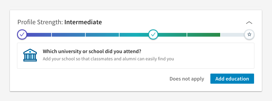
Users can get to the app quicker and will be able to explore insights created from their credit report. When users are ready, they can connect their accounts and set up their budget to add even more value.
Our Results
After testing both ends of the onboarding spectrum, we’re now exploring a middle-ground approach that balances ease and depth. After implementing this in November 2025, we noticed by February 2026 that there was a:
16% increase in users are finishing the credit pull
17% increase in starting linking accounts
10% increase in finishing account linking
10% increase in completing the budgeting
Although our results still aren’t ideal, small improvements are getting us closer to where we want to be. Our team is continuously iterating on how we can improve the conversion rate. Currently, we are experimenting with paywall placements, better security messaging, and offer a freemium experience in hopes that it will improve the conversion rates even more. The team is also tackling bugs through testing that may be affecting these numbers.

Key Learnings
Iteration is essential
Continuously testing with users helps uncover the right balance between simplicity and depth in onboarding.
Numbers alone aren’t enough
Pairing quantitative data with qualitative observation (e.g., session recordings) provides richer context and helps explain why users behave a certain way.
Value-first matters
Giving users immediate access to insights (like their credit report analysis) builds trust and increases the likelihood they’ll continue deeper into onboarding.
Move quickly
Small, timely adjustments are often more impactful than waiting to make larger, less frequent changes.
Break down complex workflows
Users are far more likely to finish time-consuming tasks like account linking or budget creation when these are split into smaller, manageable steps. Don’t assume completion will happen right away; design for flexibility and account for delays, allowing users to return and pick up where they left off.
Nudges should feel natural
Prompting users at the right time, after they’ve seen value, leads to higher engagement and less friction than pushing too early.