
Navigation Unification
Marketplace • Quote Funnel • PFM App
SuperMoney operates across disconnected platforms—a web marketplace, quote funnel, and mobile app—which created fragmented user experiences. As the company shifted to an app-first strategy, this project focused on unifying navigation across all surfaces to create a cohesive ecosystem that guides users from initial discovery to long-term engagement within the app.
Lead Product Designer
Feb - Apr 2026
Web • IOS • Android
Led the redesign of SuperMoney’s cross-platform navigation to unify the Marketplace, Quote Funnel, and Mobile App.
Audited existing navigation across platforms to identify gaps and inconsistencies
Researched competitor systems (e.g., MoneyLion, Monarch) to inform best practices
Partnered with the CEO to define a new app-centric information architecture
Designed a scalable navigation system to support seamless cross-platform experiences
Updated the design system to reflect new patterns and ensure consistency
Mapped key user flows and behaviors to optimize transitions into the app
Created a PRD to align stakeholders and support engineering handoff
RESPONSIBILITY
PLATFORMS
ROLE
TIMELINE
BACKGROUND
Our current navigation does not seamlessly connect users to the app experience.
Historically, SuperMoney’s growth was driven by its Marketplace, where users compare financial products (loans, credit cards, etc.). Over time, the company introduced a mobile app designed to support deeper financial engagement and recurring value (subscriptions, tracking, personalization).
However:
These platforms evolved independently
Navigation patterns, IA, and user flows were inconsistent
There was no clear pathway from Marketplace to App
As a result, users experienced SuperMoney as fragmented products rather than a unified financial platform.
At the same time, the business made a strategic shift:
Position the mobile app as the primary product and long-term growth engine

THE PROBLEM
The existing navigation system failed both users and the business:
User Problems
Disjointed experience between Marketplace, Quote Funnel, and App
No intuitive way to transition into the app experience
Lack of continuity in user journeys (progress, context, saved data)
Confusion around where to go next
Business Problems
Underutilization of ~2M existing Marketplace users
Missed opportunity to convert high-intent users into app subscribers
Weak ecosystem lock-in and retention
Siloed product experiences limiting cross-sell and upsell
Users
Primary Audience
Existing SuperMoney Marketplace users (high intent, comparison-driven)
Key Traits
Financially motivated (looking for better rates, loans, credit options)
Goal-oriented but often overwhelmed by choices
Value clarity, trust, and efficiency
Behavioural Insight
Many users complete a transaction (e.g., find a loan) and leave instead of continuing into a longer-term financial relationship via the app
Competitive Analysis
MoneyLion
Strong app-first ecosystem
Clear entry points into high-value features
Persistent navigation reinforcing habit loops
Monarch
Clean, simplified navigation
Focus on clarity and mental models
Strong sense of “home base” within the product
Opportunity
Reframe navigation as a growth lever, not just a UI component:
Turn the Marketplace into a top-of-funnel entry point
Use navigation to pull users into the app ecosystem
Create a continuous journey instead of isolated sessions
Information Architecture
Current information architecture

New information architecture
Current user has to go to the /app landing page to sign up as an app user
User Flow

When a user logs into SuperMoney and how they transition to the app workflow
Solution
Header
PocketBuddy sits at the intersection of three underserved needs — guided reflection, emotional intelligence, and effortless accessibility. The design challenge is to honour all three without compromising any.
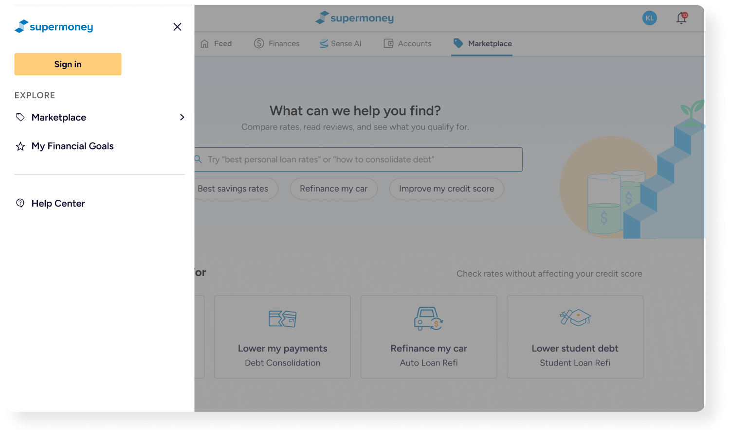
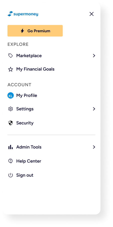
Extra Menu Screens
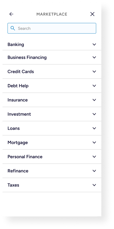
Main Nav
PocketBuddy sits at the intersection of three underserved needs — guided reflection, emotional intelligence, and effortless accessibility. The design challenge is to honour all three without compromising any.
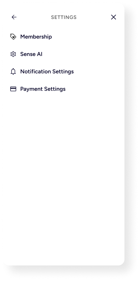
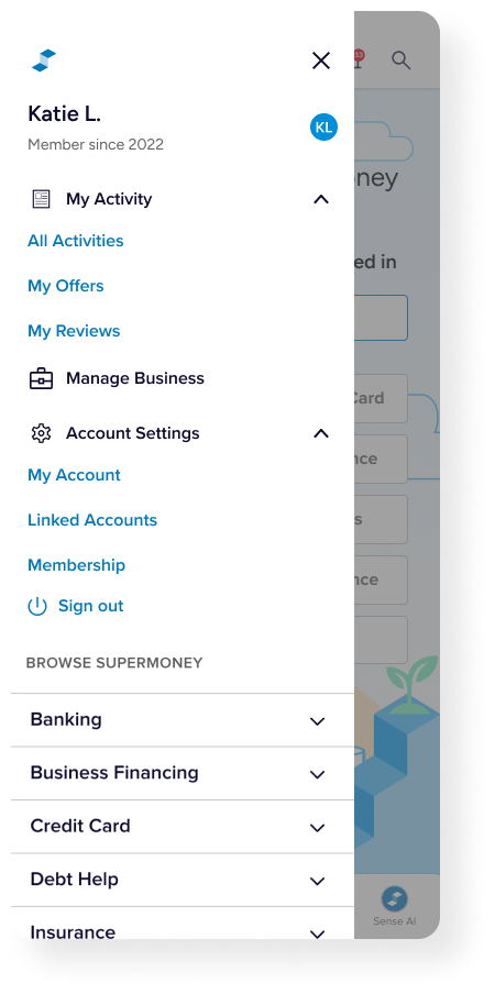
User Menu
PocketBuddy sits at the intersection of three underserved needs — guided reflection, emotional intelligence, and effortless accessibility. The design challenge is to honour all three without compromising any.


Navigation patterns and consistent UI updates
Design System
Walkthrough
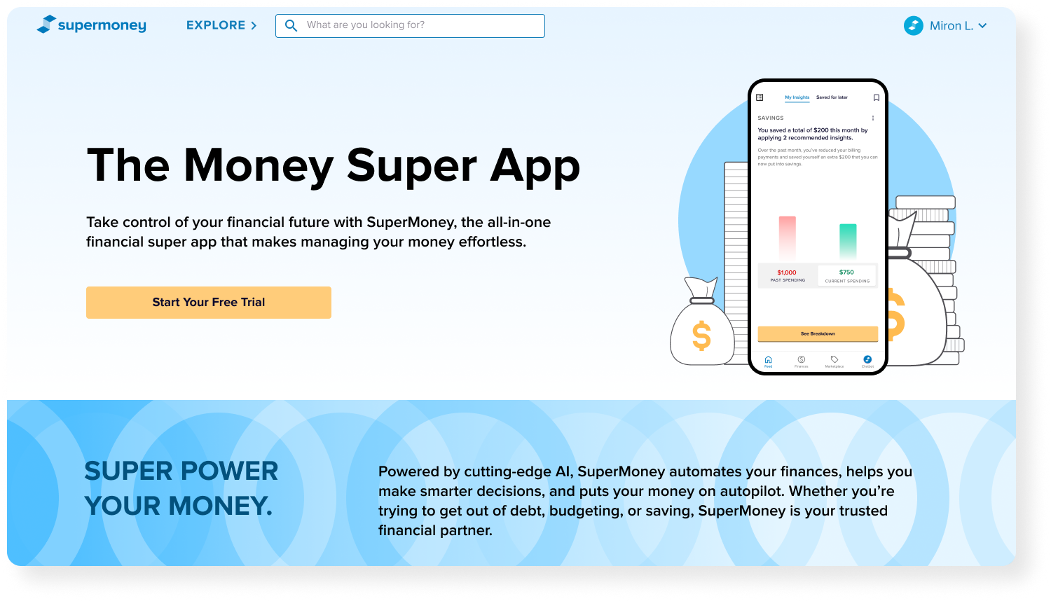
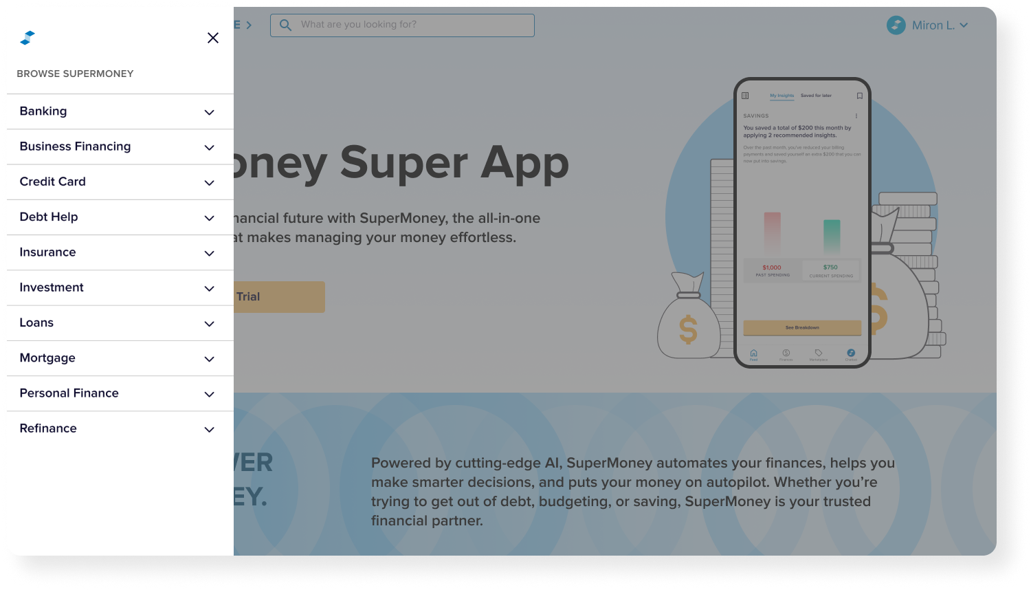
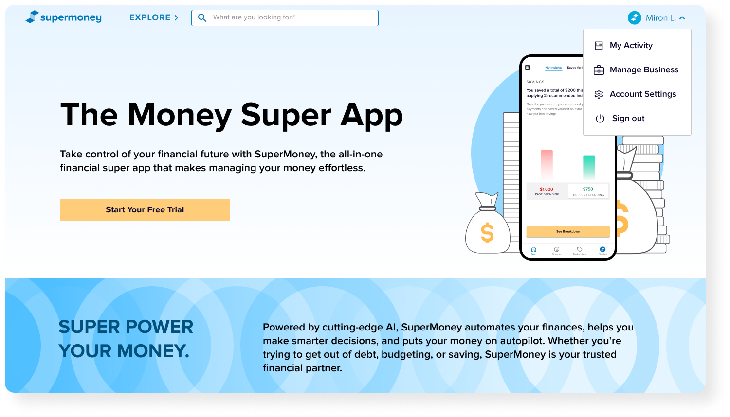
Desktop: A logged out user exploring the marketplace
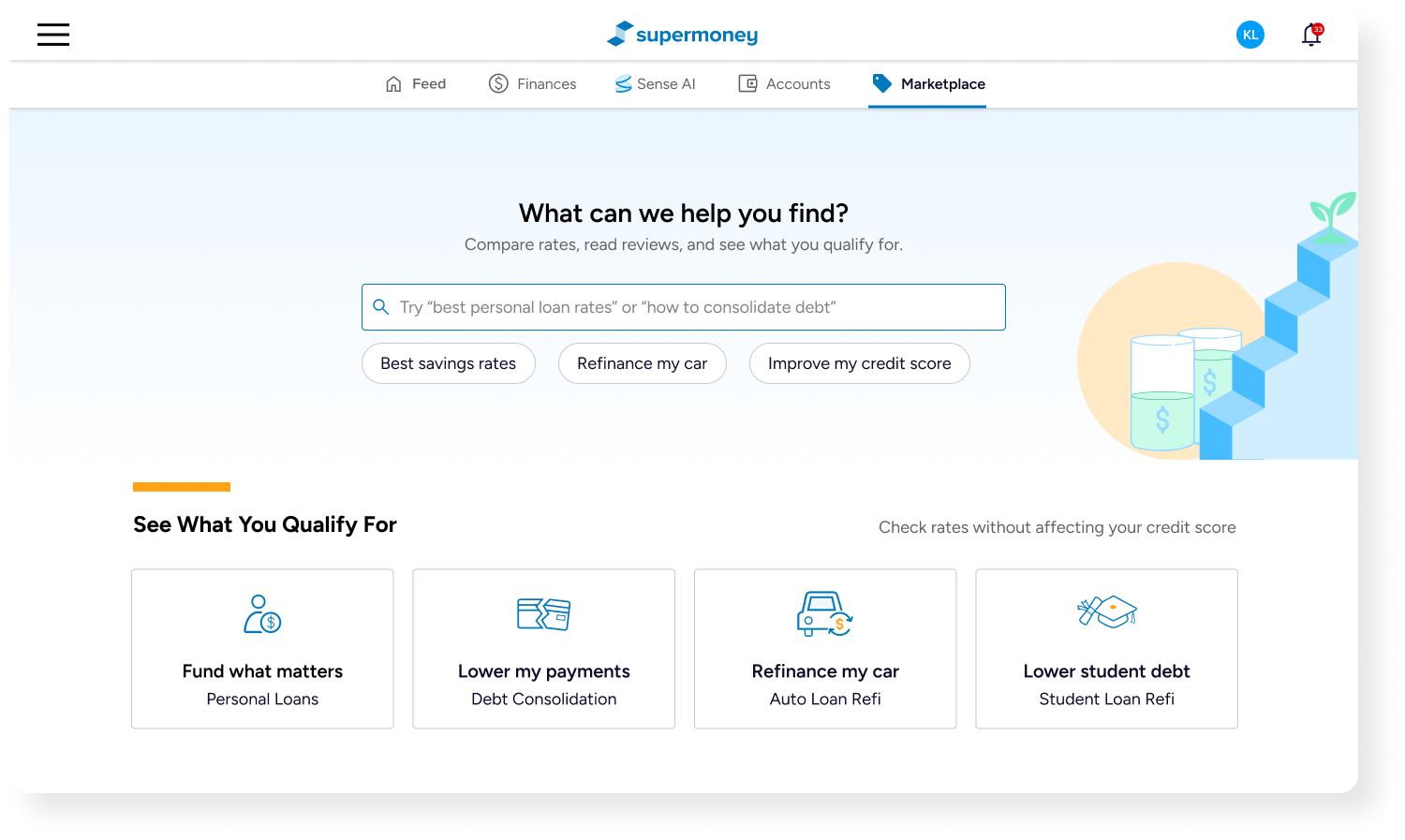
Desktop: A logged in user exploring the marketplace
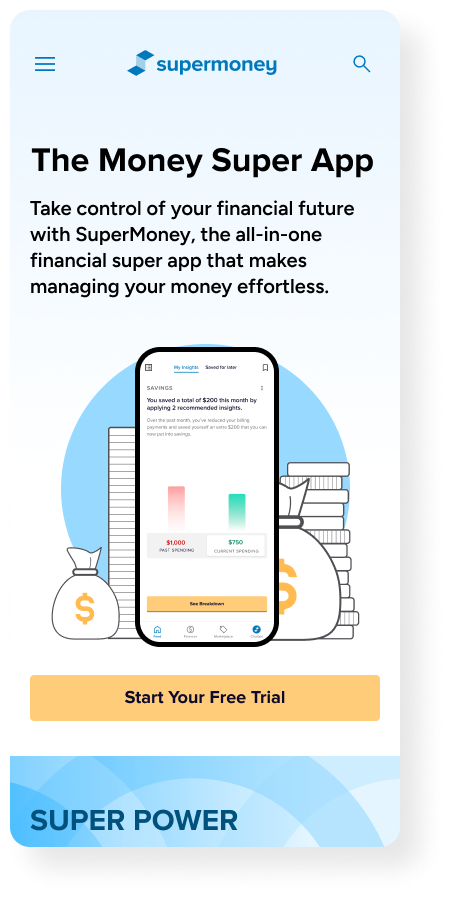
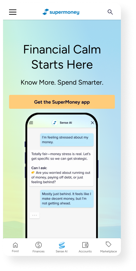
Mobile: A logged out user exploring the marketplace
Mobile: A logged in user exploring the marketplace
Impact
The navigation redesign is in the implementation phase. But we’re already seeing improvements with small adjustments and tests.

This redesign is expected to increase app adoption by leveraging high-intent Marketplace traffic and reducing friction in cross-platform transitions.

By adopting a quick navigation update to allow users to toggle between App and Marketplace, this has proven to increase discoverability and app onboarding by X%
With the unification of the app, marketplace, and offer engine navigation, users can find what they’re looking for easily and understand how each of these systems relate to each other — ultimately there for users to find financial calm.
Constraints & Considerations
Reflection
Legacy systems and technical limitations across platforms
Different teams owning Marketplace vs App
Need to avoid disrupting existing revenue-driving flows
Balancing short-term conversion with long-term retention
Navigation can directly influence business outcomes, not just usability
Aligning product surfaces requires both UX thinking and product strategy
Designing for ecosystems > designing for screens